
Why Time and Location Should Be Analysed Together
Many business datasets already contain two very powerful dimensions, time and location. Sales happen at a particular moment and in a particular place. Deliveries are completed at a certain hour and along a specific route. Service incidents occur against both an asset location and a timestamp.
Yet in many dashboards these dimensions are still treated separately. Time is explored in line charts and bar charts. Location is explored on a map. Both are useful, but they rarely work together closely enough to reveal how patterns evolve across geography.
That matters because location is not simply a way of showing where something happened. Its real value is that it allows you to bring in additional context based on place. Once a dataset is spatially enabled, it can be enriched with other geographically referenced information such as demographics, administrative boundaries, catchment areas, transport links, deprivation indices, weather, or proximity to assets and services.
This is where location becomes much more than visualisation. It becomes a way of adding meaning to an existing dataset.
When that geographic context is combined with time, the analysis becomes more powerful again. You are no longer just looking at where performance is strong or weak. You can begin to understand how patterns develop over time, whether they emerge suddenly or gradually, whether they move between regions, and what local factors may be associated with those changes.
In other words, combining time and location allows analysts to move from static reporting to a much richer form of exploratory analysis.
A More Useful Retail Example
To illustrate this, imagine a retailer analysing customer demand across the United States.
A simple version of this problem would look only at store performance. But a more revealing approach is to analyse demand by customer location, then compare that against the location of stores and the characteristics of the areas those customers live in.
In this example, sales are aggregated by County, with stores overlaid on the map as point locations. The data is also enriched with demographic information for each County and Census Tract, and time is captured at both daily and hourly level.
That creates a much richer analytical model. We are no longer asking only where sales are happening. We can start asking which kinds of areas are driving those sales, how those patterns change over time, and how store locations relate to surrounding customer demand.
From National View to Local Insight
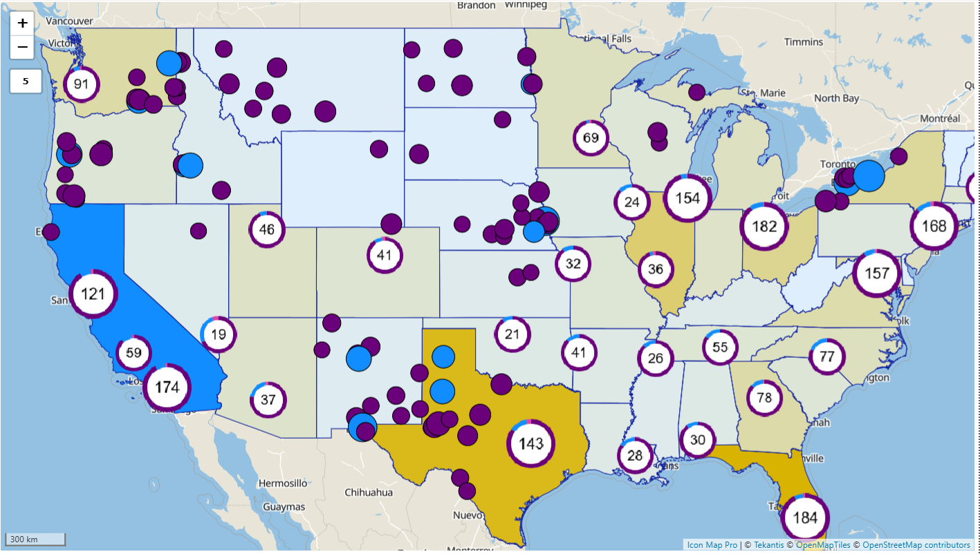
The workflow begins at a high level.
The map opens with a choropleth view of the United States. Colour is used for the total population of each state. Store locations are overlaid as circles, which are different sizes depending on each stores total sales. Multiple store locations in close proximity to each other are included in clusters to minimise the cognitive load to users.
At a glance, this already tells a richer story than a traditional map. Instead of simply seeing sales by location, the analyst can start to compare sales performance with the character of the places those customers come from.
Some locations show have high sales within states with high population profiles. Others show strong sales in areas with very different demographic characteristics. That immediately prompts more useful questions. Are certain products performing better in specific types of communities? Are some stores serving catchments with very different customer profiles? Are there areas with attractive demographics but weaker than expected sales?
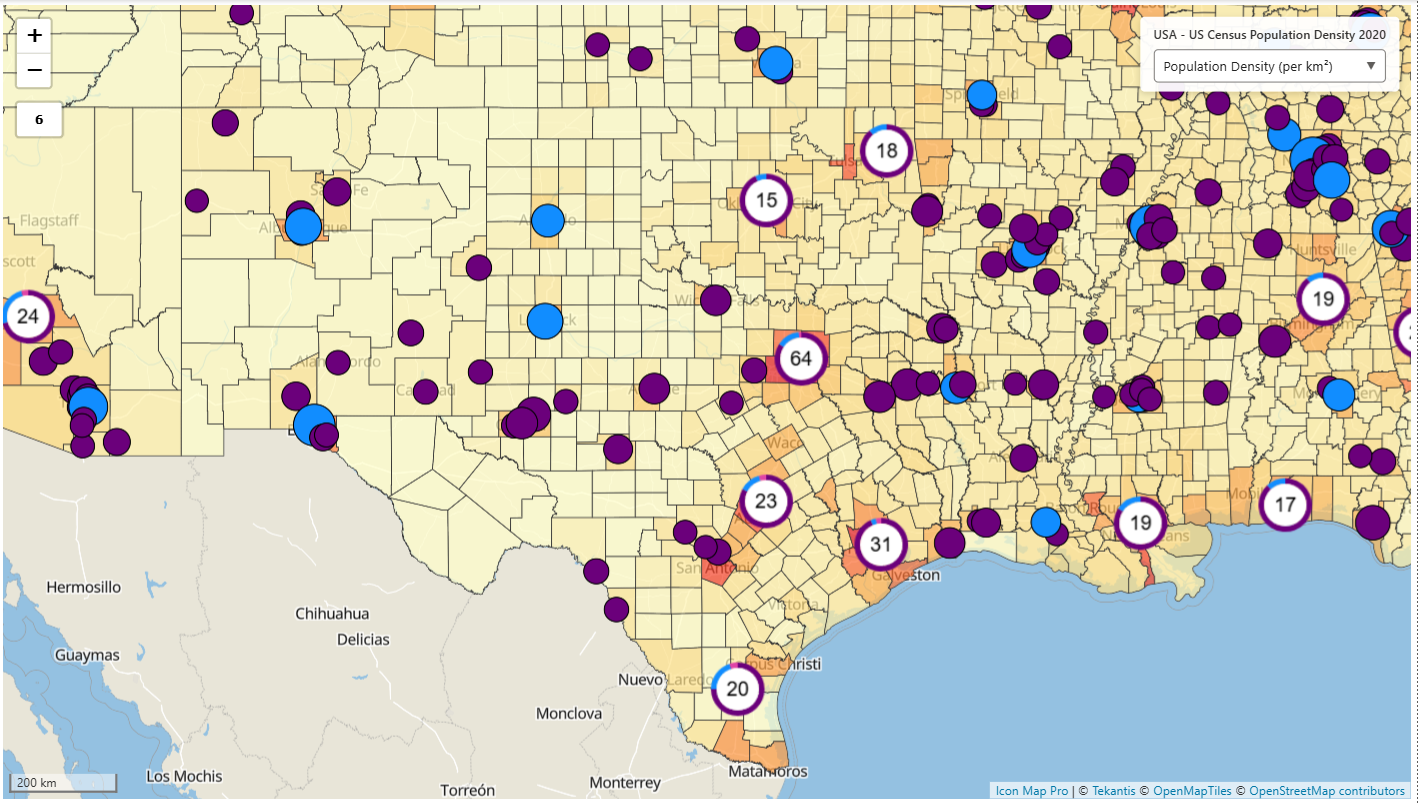
Rather than staying at this national level, the analyst can drill down.
When drilling down to county level we can start to show where certain store locations have higher sales in counties with higher populations. It might be that we would want to change the demographic metric to show population density instead. In some areas sales at stores locations are similar, while in other areas sales across store locations are widely different.
This is one of the moments where the combination of geographic hierarchy and visual richness becomes particularly useful. A flat national view can hide local variation. Drill-down reveals whether performance is genuinely broad-based or driven by a handful of hotspots.
From Total Demand to Store-Level Catchment
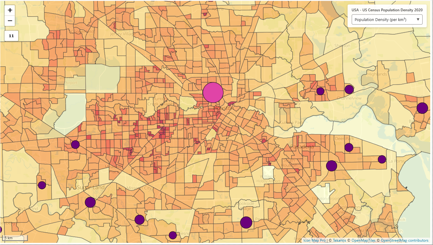
At this point, the analyst has a view of total customer demand. But the next step is to understand how this relates to individual store locations.
Zooming in on a particular store changes the story. Instead of looking at total sales across all customers, the map now filters to show the sales associated with that store and the surrounding stores. The surrounding geography becomes a picture of that location’s effective demand footprint as population density by census tract.
This makes it possible to move naturally between network-level and store-level analysis. Without selecting a store, the analyst sees the broader demand landscape. Selecting a specific location reveals the local customer pattern behind it.
That can be useful in several ways. It may show that a store performs strongly because it sits near high-value areas. It may reveal overlap between nearby stores. It may show that some stores are drawing demand from unexpected areas, or that some apparently attractive locations are not converting surrounding demand as effectively as others.
This kind of interaction turns the map into an investigative tool rather than just a display.
Bringing Time into the Analysis
So far the analysis has been spatial, but time is what turns this from a static picture into a dynamic one.
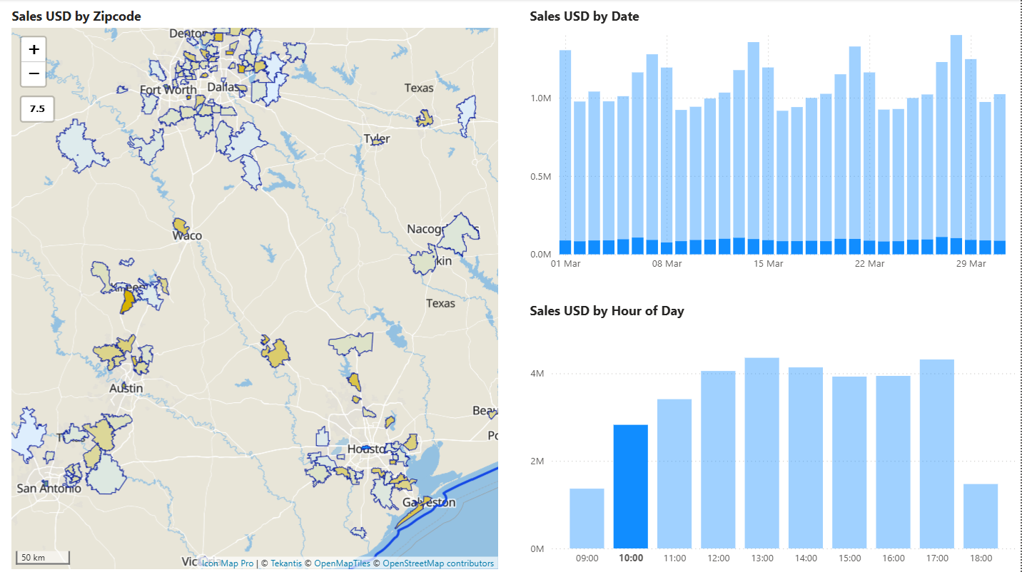
The first temporal view in the report is a bar chart by day of year. This gives a very practical way to work. Rather than using only a date picker, the analyst can select 1 or mode days to isolate a meaningful period.
That matters because temporal analysis is often not about fixed calendar periods. Analysts want to investigate a spike, compare a run of days, isolate the build-up to an event, or focus on a short period where something unusual happened. Selecting those periods directly from a bar chart makes that much more intuitive.
Suppose the analyst notices an increase in sales during a particular stretch of days. Selecting that range immediately updates the map. Now they can see where the uplift occurred, not just that it happened.
Perhaps demand was broadly national. Perhaps it was concentrated in only a handful of counties. Perhaps it was strongest in areas sharing a common demographic profile. Once again, time and location are working together to reveal something that neither could explain alone.
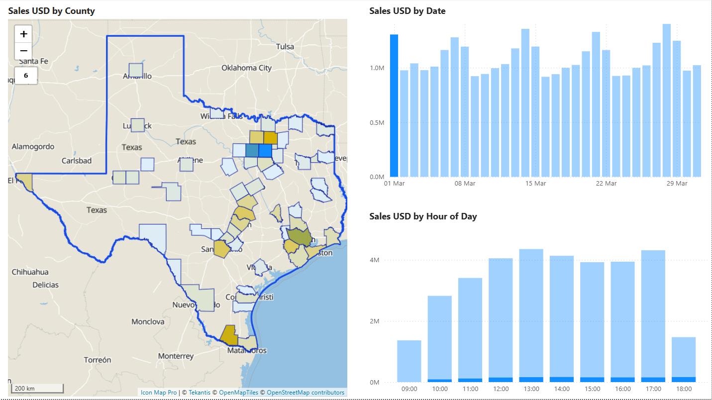
A second time visual shows hour of day. This adds another layer.
Now the analyst can ask whether geographic demand patterns also vary through the day. Some ZIP codes may show stronger lunchtime demand. Others may peak later in the evening. Some stores may align closely to commuter rhythms, others to residential patterns.
Selecting one or more hours filters the map again. This makes it possible to compare not just daily or seasonal variation, but intraday behaviour across geography.
That type of analysis can be particularly revealing when paired with demographics or urban form. Dense urban areas may behave differently from suburban ones. Tourist destinations may show different patterns from commuter towns. Looking at hourly variation geographically helps those patterns stand out.
Watching Change Happen
Static filters are useful, but there is another perspective that matters, seeing change unfold.
This is where the Play Axis becomes valuable. Rather than jumping manually between days, the analyst can animate the map across time and watch how patterns build, shift, or fade.
A hotspot may begin in one cluster of ZIP codes and then broaden outward. A short-lived surge may appear around a specific region and then disappear. Some areas may remain consistently strong while others fluctuate sharply.
Animation is not a replacement for filtering, it complements it. It is often the quickest way to spot that something interesting is happening. Once the analyst sees that movement, they can pause the animation, select the relevant days in the bar chart, and drill down further.
This creates a natural analytical workflow. The animation helps surface the pattern. The slicers and charts help isolate it. The drill hierarchy helps explain where it is concentrated. The demographic overlay helps suggest why it may be occurring.
Enriching the Story with Geographic Context
This is really the heart of why location matters.
A map is not just a background for plotting sales. The location allows the dataset to be enriched with contextual data tied to place. In this example, demographic information adds a second explanatory layer to the sales pattern. But the same principle could be extended much further.
An organisation might enrich customer demand with deprivation measures, age structure, urban density, drive-time catchments, weather conditions, tourism intensity, or proximity to competitor locations. Once data is connected to geography, it can be related to many other datasets that share the same spatial reference.
That is why location intelligence is more than plotting points. It is about using place as a key for analysis.
When combined with time, that context becomes even more valuable. Analysts can explore not just whether certain kinds of places perform differently, but whether those differences change over time, whether they are seasonal, whether they appear only during certain hours, or whether they emerge only around specific events.
Why Icon Map Pro for This Type of Analysis
This kind of workflow is where more advanced geospatial capability starts to matter.
A standard map visual can show location, and in some cases that is enough. But the workflow described here depends on combining several analytical layers in a way that gives the user a much richer route through the data.
Icon Map Pro adds value here in a number of important ways.
Geographic drill-down
The ability to move cleanly from state to county to ZIP code is central to the story. High-level patterns are useful, but they often conceal the local detail that explains what is actually happening. Hierarchical drill lets the analyst stay within the same visual and move naturally from national context to local investigation.
Overlaying different spatial layers
In this scenario, customer demand is shown as polygons while store locations are shown as circles above them. This makes it possible to compare area-based demand and point-based assets in the same view. That combination is important because many real business questions involve the relationship between regions and locations, not one or the other in isolation.
Strong integration with Power BI filtering
The value of the map depends on how well it responds to the rest of the report. Selecting bars for days or hours, drilling geographies, and selecting stores all need to work fluidly together. This is what turns the report into an exploratory workflow rather than a sequence of disconnected visuals.
Support for animated time-based analysis
The Play Axis gives an additional way to understand temporal movement. It works particularly well in combination with filtering, because it helps the analyst detect changes and then investigate them more precisely.
Taken together, these capabilities make it possible to build a much more revealing spatiotemporal experience than would be practical with basic out-of-the-box visuals alone.
Seeing More Than Where
Time and location are both powerful dimensions on their own. But their full value appears when they are combined, and when location is used not just to display data, but to enrich it with additional context.
That is when analysis starts to answer more useful questions.
Not just where sales are high, but which kinds of places are driving them. Not just when demand changes, but how those changes spread across geography. Not just which store is performing well, but how its surrounding customer landscape differs from others.
For organisations already working with time-stamped, location-aware data, this is often the next step in maturity. The data is already there. The opportunity lies in bringing the dimensions together in a way that supports genuine exploration.
And once you do that, familiar datasets often begin to tell a much richer story.